Best In-App Banner Tools 2026: Product Growth Guide

on this page ▾
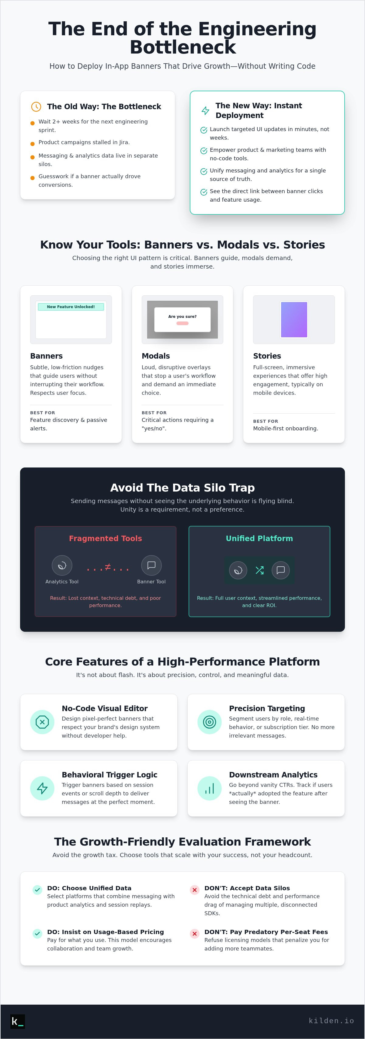
Your engineering team is too expensive to be used as a glorified UI editor. Yet, most product teams still wait two weeks for a sprint cycle just to nudge users toward a new feature. It's a waste of talent. It's a drag on growth. You know the frustration of having a perfect campaign ready, only to see it stalled by a "bottleneck" label in Jira. It's even worse when your messaging data lives in one tool while your analytics live in another, leaving you guessing if that banner actually drove a conversion.
We're going to fix that. This guide shows you how to choose and deploy an in-app banner tool that drives adoption without developer bottlenecks or fragmented data silos. You'll learn to launch targeted campaigns in minutes and finally see a direct link between banner clicks and actual product usage. We'll evaluate the top-performing platforms for 2026, focusing on tools that prioritize unified data and skip the predatory per-seat licensing models that penalize your success. It's time to stop guessing and start growing.
Key Takeaways
- Stop waiting for engineering sprints. Learn to deploy a no-code in-app banner tool that lets your product team launch targeted UI updates in minutes.
- Move beyond static notices. Discover how to use behavioral nudges to drive feature adoption by targeting users based on their specific roles and real-time actions.
- Avoid the growth tax. Evaluate tools based on integration complexity and usage-based pricing models that don't charge you extra for adding teammates.
- Close the feedback loop. See how unifying your messaging with product analytics and session replays provides the "truth" behind every user interaction.
Table of Contents
- What is an In-App Banner Tool and Why Does It Matter?
- Core Features of a High-Performance In-App Banner Platform
- Evaluation Framework: Choosing a Tool That Scales
- Strategic Use Cases: From Feature Discovery to Emergency Alerts
- Why Kilden is the Logic Choice for Unified In-App Engagement
What is an In-App Banner Tool and Why Does It Matter?
An in-app banner tool is a software solution that enables non-technical teams to trigger UI overlays or inline notices without touching a single line of code. It effectively ends the engineering bottleneck for simple interface changes. In the past, banners were static, site-wide announcements used for maintenance or basic alerts. By 2026, the industry has shifted toward "Behavioral Nudges." These are dynamic, context-aware prompts triggered by specific user actions or attributes. They don't just sit there; they respond to the user's journey in real time.
Banners outperform push notifications for deep-product engagement because they respect the user's current focus. While push notifications are designed to bring users back to the app, banners guide them while they are already active. This is critical because the average attention span on a screen has dropped to just 47 seconds in 2026. You have a narrow window to deliver value. This delivery relies on the foundational technology of real-time digital communication to ensure messages appear exactly when they are most relevant. For any Product-Led Growth (PLG) strategy, banners are the primary tool for driving users toward their next "Aha!" moment.
Banners vs. Modals vs. Stories: Knowing the Difference
The low-friction nature of a banner often beats a disruptive modal. Modals are loud. They stop the user's workflow and demand an immediate choice. Banners are subtle. They provide a path forward without forcing a halt. Use a banner for passive awareness, like a new feature announcement or a gentle reminder. Reserve modals for critical actions that require an immediate "yes" or "no." For mobile-first apps, full-screen stories offer high engagement, but banners remain the superior choice for desktop and web applications where utility and workflow continuity are the priorities.
The Problem with Fragmented Banner Tools
Most teams fall into the "Data Silo" trap. They use one tool for analytics and another in-app banner tool for engagement. This is a mistake. Sending messages without seeing the underlying behavior is flying blind. When your tools don't talk to each other, you lose the "truth" of the user experience. Managing multiple SDKs also adds technical debt and slows down your app's performance. Your engagement tool must understand your "Feature Flags" state. If a feature is toggled off for a specific segment, your banner tool should know that automatically. Unity between your data and your messaging isn't just a preference; it's a requirement for scaling efficiently.
Core Features of a High-Performance In-App Banner Platform
High-performance isn't about flashy animations. It's about precision. A modern in-app banner tool must bridge the gap between marketing intent and technical reality. This starts with a no-code visual editor that actually respects your brand's design system. You shouldn't need a developer to ensure your banner doesn't break the layout. If the editor feels like a toy, the output will look like one too. Demand a tool that allows for pixel-perfect control while maintaining ease of use.
Precision targeting is the next pillar. If you're blasting every user with the same message, you're just creating noise. You need to segment by user role, behavior, or subscription tier. A Pro user shouldn't see an upgrade prompt. A new user shouldn't see an advanced feature alert. This requires a tool that syncs with your live user data in real time. Then there's trigger logic. Timing is everything. Triggering a banner based on session events or scroll depth ensures the message appears when the user is mentally ready to receive it. Finally, look for real-time analytics that track actual downstream feature adoption. Click-through rate (CTR) is a vanity metric. The only "truth" is whether the user actually used the feature after seeing the banner.
Visual Flexibility: Inline vs. Floating Styles
Style dictates impact. Inline banners are embedded directly into your layout. They make announcements feel like a native part of the UI, which reduces friction and builds trust. Floating or "toast" banners are high-visibility notices. They're perfect for time-sensitive alerts or maintenance windows. Choosing the right style requires understanding the core principles of mobile UX; specifically, balancing visibility with the user's primary task. For those who need more control, ensure your in-app banner tool allows custom CSS and templating. This provides developer-level polish without the developer-level workload.
Behavioral Triggering and Sequencing
Banners should be smart. If a session replay shows a user struggling with a specific workflow, that is your "User Drop-off" trigger. Use that moment to deploy a helpful nudge. But be careful. Sequencing is vital. Nothing ruins a user experience faster than seeing three different banners at once. Your platform must prioritize messages. If a critical system alert is active, the feature nudge should wait. Implement frequency capping to prevent "banner blindness." If a user ignores a message three times, stop showing it. Respect their intelligence. If you want to see how this looks in a unified environment, you can explore Kilden's engagement dashboard to see behavioral triggers in action.
Evaluation Framework: Choosing a Tool That Scales
Choosing an in-app banner tool shouldn't be a beauty contest for the UI editor. Most buyers get blinded by drag-and-drop features. They ignore the plumbing. If the plumbing is leaky, your growth will stall. You need to look under the hood at the integration complexity. Does the tool require a heavy, bloated SDK that slows down your app? Or is it a simple, performant API call? Heavy SDKs increase app launch times and frustrate users. Performance impact is a critical metric. Latency in banner delivery can make a message feel like a glitch rather than a helpful nudge.
Data unity is your next non-negotiable requirement. If your banner tool can't see the same user identity as your product analytics platform, you're creating a new silo. You'll spend hours trying to map "User A" in your messaging tool to "User A" in your product database. It's a waste of time and energy. A unified identity ensures that when a user interacts with a banner, that event is immediately visible in their behavioral profile. This is the only way to achieve a "single source of truth" for your product growth experiments.
The "Per-Seat Tax" vs. Flat-Scale Pricing
Per-seat licensing is a relic of the past. It's a tax on collaboration. When you pay per seat, you hesitate to invite the whole team into the platform. This creates a bottleneck where only one or two people can launch campaigns. Product, Marketing, and Engineering must work together to be effective. Forbes notes that being strategic and thoughtful with user engagement requires cross-functional alignment. Evaluating the total cost of ownership (TCO) as your Monthly Active Users (MAU) grow is vital. You shouldn't be penalized for your own success. Look for a model that scales with your usage, not your headcount.
Developer Experience and SDK Health
Developer experience is more than just "good docs." It's about SDK health and flexibility. Your in-app banner tool must support your entire stack, whether that's web, iOS, or Android. Check the documentation for API flexibility. Can you trigger banners programmatically? Most importantly, ensure the tool integrates with your Feature Flags. You should be able to roll out a banner to a small percentage of users first to test the impact. If the banner causes a drop in core metrics, you need the power to kill it instantly without a new code deploy. This level of control is what separates professional growth tools from basic messaging widgets.
Strategic Use Cases: From Feature Discovery to Emergency Alerts
Your product is a living system. It needs a way to talk to its users without breaking their flow. Strategic use of an in-app banner tool turns a static interface into a conversation. Stop thinking about banners as interruptions. Start thinking about them as guidance. In a B2B SaaS context, the goal is to move users through a lifecycle, not just show them ads. This requires a nuanced approach to placement and timing.
New feature announcements are the most common use case. But don't force a 10-step product tour on everyone. Most users skip them. Instead, use an inline banner near the new functionality. It sits quietly within the UI and feels native. This builds trust. For subscription upgrades, the strategy shifts. When a user hits a feature limit, they are in a high-intent state. They need more power now. This is the time for a floating banner. It provides the high visibility required for an urgent decision. You can also use banners for incident management. If a bug is affecting a specific module, tell the users before they find it. It reduces support tickets and preserves your brand reputation.
Optimizing the Onboarding Funnel
Onboarding is a race against time. You have seconds to prove your worth. Use banners to nudge users toward their "Aha!" moment. If they haven't completed a core setup task, a subtle inline banner can provide the necessary instruction. This reduces friction and speeds up the journey to success. Time-to-Value is the primary metric for onboarding success, defined as the duration between a user's initial login and the exact moment they achieve their first meaningful outcome. Well-placed instructional banners are the fastest way to shorten this window.
Retention and Win-Back Campaigns
Retention is about reminding users why they signed up in the first place. Targeting inactive users with "What’s New" banners can reignite interest. But the real power lies in fixing friction. Use session replay data to see where users are getting stuck. If the data shows a recurring struggle, deploy an in-app banner tool to offer a shortcut or a tip at that exact coordinate. It shows the user you're paying attention to their experience. You can also use these prompts as an entry point for surveys. If a user dismisses a feature alert twice, ask them why. The answer is usually the key to preventing their next churn event.
Ready to turn these strategies into active campaigns? Start launching behavioral banners with Kilden and bridge the gap between your analytics and your engagement.
Why Kilden is the Logic Choice for Unified In-App Engagement
Most growth stacks are a mess of disconnected tools. You send a banner from one platform and track the results in another. It's inefficient. It's frustrating. Kilden was built to end this fragmentation. Our philosophy is simple. We eliminate the wall between your analytics and your messaging. When you use Kilden as your in-app banner tool, you aren't just sending a notice. You are acting on a single source of truth. You get wholeness instead of fragments.
We provide a unified identity for every user. This means your feature flags, product analytics, and banners all live in one dashboard. There's no manual data engineering required to see how a banner affected a specific cohort. If a user sees a banner, that event is instantly tied to their behavioral profile. This approach respects your time and your data integrity. It's a more human way to build software because it focuses on the actual person behind the data point. You see the reality of their journey, not just a row in a database.
Integrated session replay is our secret weapon. Don't guess why a banner isn't converting. Watch the replay. See exactly how users interact with your UI in real time. You might find that a floating banner is obscuring a critical button or that the copy is confusing for a specific segment. This level of clarity is impossible when your messaging and replay tools are siloed. By 2026, the "per-seat tax" has become the biggest obstacle to team agility. Kilden offers no per-seat licensing. We want your entire team in the platform. Collaboration shouldn't increase your bill. It should increase your growth.
Launch Faster with Kilden’s No-Code Editor
Speed is a competitive advantage. You can go from an idea to a live banner in under five minutes. Our no-code editor is built for utility, not just aesthetics. We provide templates specifically designed for high-conversion SaaS workflows. You don't need to reinvent the wheel. Just pick a template, adjust the copy, and set your behavioral triggers. You can also A/B test your banners in real time. Find the perfect placement and copy without a single code deploy. It's about technical agility and decisive action.
The Power of Integrated Analytics
Stop reporting on vanity metrics. Views and clicks don't pay the bills. Kilden moves you toward revenue impact. Because our analytics and messaging are unified, we can show you exactly how a banner campaign drove feature usage or subscription upgrades. This eliminates the need for complex data mapping or the "Data Silo" trap we discussed earlier. You get the truth, immediately. Build your first in-app banner with Kilden today.
Unify Your Data and Deploy With Confidence
The era of fragmented growth stacks is ending. You've seen the cost of complexity. Managing an in-app banner tool shouldn't require a developer every time you want to nudge a user toward value. It shouldn't require manual data mapping just to see if your campaign worked. True efficiency comes from wholeness. It comes from having your analytics, session replays, and engagement tools in a single dashboard.
Stop paying a "per-seat tax" for team collaboration. Your entire team deserves access to the truth of the user experience. With no-code campaign management and unified identity, you can launch targeted nudges in minutes and see the direct link to feature adoption. Stop fighting your stack and start using it. The logic is self-evident. Build a product experience that respects your users and your time.
Stop paying for fragmented tools. Try Kilden for free.
Frequently Asked Questions
What is the difference between an in-app banner and a push notification?
Push notifications are external hooks designed to pull users into your app from their lock screen. In-app banners are internal guides meant to interact with users who are already active. Use push for re-engagement and banners for feature discovery or workflow guidance. Banners are less intrusive because they don't interrupt the user's life outside the app. They focus on the immediate context of the current session.
Do in-app banner tools slow down my application?
Performance depends entirely on the SDK's architecture. A modern in-app banner tool should load asynchronously to ensure it doesn't block the main thread of your application. This prevents "jank" or lag during the user experience. Always check the payload size of any tool you integrate. If the SDK is bloated, it will increase your app's initial load time and frustrate your users. Efficiency is non-negotiable.
Can I target in-app banners based on specific user behavior?
Behavioral targeting is the core of a modern strategy. You can trigger messages based on specific events like clicking a button, reaching a page depth, or completing a setup step. This ensures the banner is relevant to the user's current task. If a user gets stuck in a funnel, a behavioral nudge can provide the exact help they need to move forward. It turns a static UI into a responsive environment.
Is it possible to A/B test in-app banners?
A/B testing is essential for optimizing adoption rates. You can test different headlines, button colors, or even the placement of the banner itself. Most platforms allow you to split traffic between two versions and track which one leads to higher feature usage. Don't guess which copy works better. Use data to prove it. This iterative approach is the fastest way to refine your product-led growth strategy.
How do I avoid "banner blindness" in my product?
Relevance is the only cure for banner blindness. If a message isn't useful, users will ignore it. Use frequency capping to ensure a user doesn't see the same notice ten times in a single day. Implement priority sequencing so critical alerts aren't buried by minor feature updates. If your in-app banner tool is powered by real-time behavioral data, your messages will feel like helpful tips rather than annoying interruptions.
Do I need a developer to launch an in-app banner campaign?
You need a developer for the initial SDK installation, but not for the daily operations. Once the plumbing is set up, product and marketing teams can use no-code editors to build, target, and launch campaigns. This eliminates the two-week wait for a sprint cycle. You can react to user data in minutes. It empowers the people closest to the user to make changes without technical bottlenecks.
What metrics should I track to measure banner success?
Stop focusing on click-through rates. CTR is a vanity metric that doesn't prove value. You should track feature adoption, retention, and revenue impact. Did the user actually use the tool you promoted? Did their lifetime value increase after seeing the upgrade prompt? Use session replays to see how users interact with the banner before they click. The truth is found in the actions they take after the interaction.
Can in-app banners be used for both mobile and web apps?
Yes. Professional tools provide cross-platform support for web, iOS, and Android. The implementation might vary slightly between environments, but the targeting logic and visual editor remain the same. This allows for a unified brand experience across all devices. Your users shouldn't feel like they are using two different products when they switch from their desktop to their phone. Consistency builds trust and speeds up adoption.