How to Find Exactly Where Users Get Stuck in Your Product: A Data-Driven Guide

on this page ▾
You are losing users, and your current dashboard is lying to you by omission. It shows you the drop-off, but it hides the "why." To truly find where users get stuck in product flows, you need more than a series of disconnected charts. You need a bridge between raw events and actual human behavior.
We know the frustration. You see a massive spike in churn during onboarding, yet your analytics and session recordings live in separate worlds. Vague heatmaps don't explain intent; guesswork doesn't win budget. It's time to stop wondering why users vanish and start seeing the truth of their experience.
This guide provides a systematic framework to identify and fix product friction. You'll learn how to break down data silos and use a unified approach to map out every point of resistance. We are moving past the "what" to reveal the "why," giving you the proof you need to drive higher conversion rates and justify every UI change to your stakeholders. It's a faster, more logical path to a better product.
Key Takeaways
- Identify the three primary drivers of friction, specifically technical bugs, cognitive overload, and lack of motivation, to move beyond surface-level churn data.
- Leverage high-level funnel segmentation to find where users get stuck in product flows and isolate the highest-impact friction points.
- Decode user intent by filtering session replays for specific friction signals like rage clicks, dead clicks, and thrashed cursors.
- Apply a systematic 5-step framework to transition from raw data observation to definitive, stakeholder-ready UI solutions.
- Deploy real-time guidance using product tours to unstick users instantly while your team works on permanent code fixes.
Table of Contents
- The Anatomy of Friction: Why Users Get Stuck
- Step 1: Mapping the "Where" with Product Analytics
- Step 2: Seeing the "Why" with Session Replay
- A 5-Step Framework to Unstick Your Users
- Closing the Loop: Fixing Friction in Real-Time
The Anatomy of Friction: Why Users Get Stuck
Friction is not a vague design concept or a poetic metaphor for a bad user experience. It is a technical reality. In the context of your software, friction is the gap between user intent and successful execution. When a user wants to complete a task but the interface demands too much effort, they stop. To find where users get stuck in product environments, you must first acknowledge that every second of confusion is a direct path to churn. If your product is hard to use, users will find one that isn't. It's that simple.
Understanding this requires a deep dive into Usability and how it impacts the bottom line. Most friction falls into three specific categories. First, technical bugs are the obvious killers; if a button doesn't work, the journey ends. Second, cognitive overload happens when you present too many choices or unclear instructions. The user's brain stalls. Third, a lack of motivation occurs when the effort required outweighs the perceived reward. In all three cases, the result is the same: a lost customer. Traditional analytics tools capture the final click but fail to record the thirty seconds of hesitation that preceded it.
The Quantitative Signal: Funnel Drop-offs
Traditional analytics are great at telling you that something went wrong. You look at your sign-up funnel and see a "leaky bucket" at step three. Maybe 40% of users drop off between entering their email and creating a password. This is your quantitative signal. It marks the location of the friction but remains silent on the cause. You must distinguish between a slow exit, where a user hesitates before leaving, and a hard bounce, where they vanish instantly. One suggests confusion; the other suggests a technical failure or a total loss of interest. Setting up baseline conversion metrics for every step allows you to spot these anomalies before they become trends.
The Qualitative Reality: Human Behavior
Data points like "average time on page" are often lies. A high time on page could mean deep engagement, or it could mean the user is desperately searching for a "Submit" button that is hidden below the fold. You cannot rely on averages to understand individuals. Real human behavior is messy and non-linear. When user expectations clash with your UI logic, friction wins. User Friction is the resistance between a user’s goal and the interface’s requirements. To find where users get stuck in product flows, you have to watch the struggle, not just read the report. You need to see the hesitation, the backtracking, and the moment of final frustration that leads a user to close the tab forever.
Step 1: Mapping the "Where" with Product Analytics
Data doesn't lie, but it often hides the lead. To find where users get stuck in product flows, you must start with a high-level funnel analysis. You are looking for the largest percentage drop between steps. If 1,000 people start your sign-up process and only 200 reach the dashboard, you have a 1,000-person problem at a specific coordinate. This is where Customer journey mapping becomes a tactical tool rather than a theoretical exercise. You aren't just drawing lines; you are identifying the exact point of failure.
Once you locate the drop-off, segment the data. Filter by device, browser, and user cohort. If Chrome users convert at 30% while Safari users drop at 95%, you don't have a UX problem; you have a technical bug. Ruling out these variables prevents you from redesigning a page that simply needs a code fix. Use event tracking to see the last action taken. Identifying "Dead Ends"—pages with high exit rates but no clear conversion goal—reveals where your product's logic simply stops. Using integrated product analytics allows you to see the last button clicked before a user vanished, providing the first clue in your investigation.
Building High-Impact Funnels
Create linear funnels for your core value proposition. Don't just track the "Big Win" like a purchase. Track micro-conversions: uploading a file, inviting a teammate, or clicking a settings toggle. These small actions signal progress. Watch for "Looping Behavior." This happens when users go back and forth between two steps, like a payment page and a plan selection screen. Looping is a loud signal of indecision or error. It means your interface is asking for information the user doesn't have or can't provide.
Heatmaps vs. Reality
Click-maps are often deceptive because they lack the dimension of time. They show you where people clicked, but not the sequence. A user might click a non-functional element ten times before finally finding the "Next" button. Static data cannot capture this struggle. Similarly, check your scroll-depth. If your primary CTA is at the bottom of the page and 70% of users never scroll past the fold, you've found your friction. In a dynamic SaaS environment, static heatmaps are just a snapshot; they don't tell the whole story of a moving, breathing user session.
Step 2: Seeing the "Why" with Session Replay
If product analytics is the smoke, session replay is the fire. You already know which screen is the problem. Now you need to witness the friction. Watching a recording is the only way to find where users get stuck in product flows with absolute certainty. It transforms a cold data point into a human story. You aren't guessing about intent anymore; you're seeing it in real-time. This is where the humanity of your users becomes visible, revealing the struggle behind the statistics.
Most teams waste hours watching random sessions. This is a mistake. You must filter your replays by specific friction signals to get results. Look for rage clicks, dead clicks, and thrashed cursors. These are the digital breadcrumbs of a failed experience. When you see a user hovering over a button for ten seconds before clicking away, you've found the moment their motivation died. The 30 seconds leading up to a drop-off are the most valuable data points you own. That window contains the hesitation, the confusion, and the final decision to quit. It is the truth of the user experience.
Identifying Rage Clicks and Dead Clicks
Rage clicks occur when a user clicks the same element repeatedly in a short burst. It's a signal of broken functionality or extreme UI lag. Rage clicks are the digital equivalent of a user shouting at your product. Dead clicks are different. They happen when a user interacts with an element that looks clickable but isn't. This suggests your visual hierarchy is lying to the user. Both signals tell you exactly where your interface is failing to meet human expectations. If you see these patterns, stop debating the design and start fixing the friction immediately.
The "Single Identity" Advantage
Data silos destroy efficiency. If your analytics tool is separate from your session replay tool, you're losing context in the gap. You shouldn't have to manually search for a user ID across two different platforms. The real power comes from a unified identity. This allows you to jump instantly from a funnel drop-off event to the exact video segment of that failure. You eliminate the guesswork. You move from "I think they are confused" to "I know they can't find the save button" in seconds. This integration reduces your time-to-insight from hours of manual review to a few minutes of targeted observation. It's about clarity and unity, not just more data. By consolidating these tools, you create a single source of truth that respects your team's time and intelligence.
A 5-Step Framework to Unstick Your Users
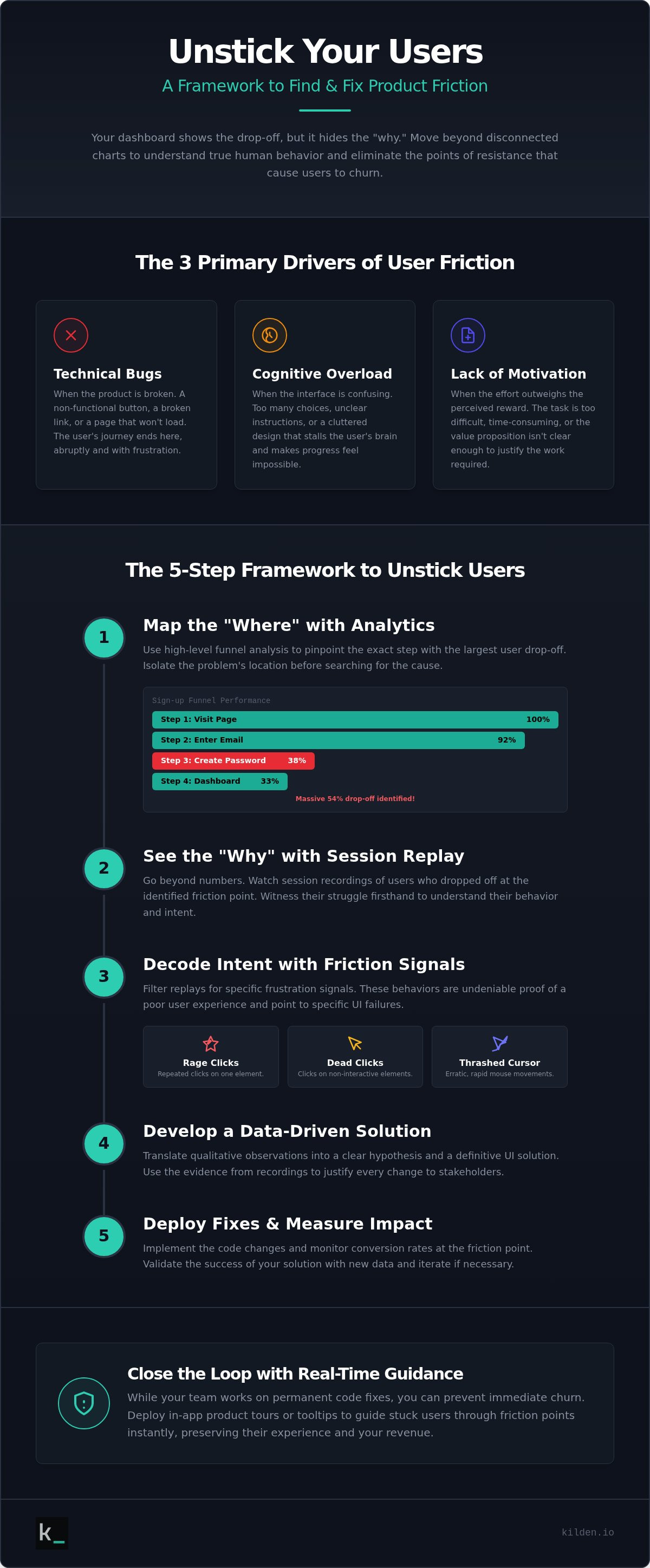
Identifying a problem is only half the battle. Solving it requires a surgical approach that moves from observation to execution without wasting development resources. Most teams fail because they try to fix everything at once. They see a dozen friction points and end up paralyzed by choice. To effectively find where users get stuck in product environments, you need a diagnostic framework that prioritizes impact over activity. Stop guessing. Start measuring. Follow this five-step sequence to turn drop-off data into conversion wins.
- Isolate: Pick the single step in your funnel with the highest drop-off rate. Focus on the path to your core value proposition.
- Observe: Watch 10 to 20 filtered session replays of users who reached that specific step but failed to progress.
- Hypothesize: Define the specific friction point in plain English. For example, "Users don't realize the credit card field is required for the free trial."
- Test: Use Feature Flags to roll out a targeted fix to a small percentage of your traffic. This limits risk while gathering data.
- Measure: Compare the conversion rate of the test group against the control. If the numbers don't move, your hypothesis was wrong. Move to the next one.
This methodical loop ensures that every UI change is backed by evidence. It respects your technical intelligence and your developer's time. By isolating variables, you eliminate the noise and focus on the truth of the user experience. Implement this framework today with a unified data platform.
Isolating the Friction Point
Focus on the "Aha! moment" path. If users don't reach the core value of your software, they won't stay. Prioritize friction based on business impact and ease of fix. A confusing button label is a five-minute fix with massive upside. A broken third-party integration might take weeks. Use session tagging to organize your findings. This allows your engineering and product teams to review the same "truth" without jumping between disconnected tools. Clarity is the antidote to wasted dev cycles.
Validating with In-App Surveys
Sometimes the data shows you the struggle, but you still need the "why" from the user's perspective. Trigger an In app survey exactly when a user shows exit intent. Keep it blunt. Ask one question with three clear options. No marketing fluff. "What stopped you from finishing?" This direct feedback, combined with observed behavior from session replays, provides a complete picture of the human experience. It bridges the gap between raw events and human intent, giving you the confidence to act decisively.
Closing the Loop: Fixing Friction in Real-Time
Logic dictates that once you identify a problem, you fix it. But in the world of product development, the ideal solution is often the slowest. Redesigning a core UI component might be the "right" long-term move, but it requires a dev sprint, QA testing, and a deployment cycle. You can't afford to let users struggle for two weeks while you wait for a code change. Once you use data to find where users get stuck in product flows, the clock starts ticking. You need an immediate intervention to bridge the gap between the current friction and the future fix.
This is where real-time guidance becomes your most valuable asset. If the analytics show a drop-off and the session replay reveals confusion, you can deploy In app banners or Product Tours to clarify the path instantly. This isn't a workaround; it's a strategic layer of communication. The Kilden approach relies on a simple, three-part loop: Analytics tells you where the friction is, Replay tells you why it's happening, and Messaging fixes it in the moment. It turns your product from a static interface into a responsive environment that respects the human behind the screen.
Deploying Targeted Product Tours
Don't force every user through a mandatory tour. Instead, create "Just-in-Time" tours triggered by specific behavior. If a user lingers on a complex settings page for more than 40 seconds without taking action, trigger a two-step tour to guide them. This is a no-code implementation. You fix the UX without waiting for a developer to touch the codebase. By measuring the correlation between tour completion and funnel success, you prove the value of the intervention. You move from passive observation to active assistance, ensuring that your core value proposition is never obscured by a temporary UI hurdle.
Unified Strategy for Long-Term Growth
Fragmented tools create fragmented insights. If your analytics live in one platform and your engagement tools in another, you're paying a "complexity tax" every single day. Most legacy vendors charge per-seat for these insights, which effectively punishes you for growing your team. We believe that access to the truth shouldn't be gated by a licensing model. By moving toward a Single Source of Truth, you align your product, engineering, and marketing teams around the same set of human-centric data points. This unity is what drives sustainable growth and eliminates the guesswork that kills conversion rates. Stop guessing. Start finding your product friction with Kilden and turn your data into a decisive roadmap for success.
Turn Friction Into Growth
You now have the framework to bridge the gap between what happened and why it happened. We've moved from high-level funnel mapping to the granular reality of session replays. You've learned how to isolate a single point of failure and deploy immediate, no-code interventions like product tours to keep users moving. To find where users get stuck in product flows is to identify the exact moment your user's intent meets resistance. It is the difference between guessing and knowing.
Stop letting fragmented data silos slow your progress. Kilden provides a single source of truth by combining product analytics, session replays, and engagement tools in one interface. We don't believe in per-seat licensing because insights should be accessible to your entire team, not just a select few. This is about empowering you to build a more human, efficient product experience. Your users deserve a path without obstacles. It's time to build it.
Eliminate product friction with Kilden’s unified platform
Frequently Asked Questions
What is the difference between product analytics and session replay?
Product analytics provide the quantitative "what" by tracking events, counts, and funnel drop-off rates. Session replay provides the qualitative "why" by recording the actual user journey. You need both to find where users get stuck in product flows efficiently. Analytics identifies the coordinates of the problem; replay shows you the human struggle at that location.
How many session replays do I need to watch to find a friction point?
You don't need to watch hundreds of sessions. Focus on 10 to 20 filtered replays of users who dropped off at a specific funnel step. This sample size is usually enough to identify a recurring pattern. If five users struggle with the same form field, you've found your friction point. Quality of observation beats quantity of data every time.
What are rage clicks and why do they happen?
Rage clicks are a burst of rapid clicks on a single element within a short timeframe. They happen when a user expects an action that doesn't occur, such as a broken button or a slow-loading page. It's a loud signal of digital frustration. When you see these, your interface is failing to meet the user's intent or technical requirements.
Can session replay software slow down my product performance?
Modern session replay tools use lightweight, asynchronous scripts that don't block the main thread. They capture DOM changes rather than recording a heavy video file in real-time. This ensures minimal impact on your product's performance. If implemented correctly, your users won't notice the script is running. Performance overhead is a solved problem in 2026.
How do I know if a user is stuck or just distracted?
A distracted user goes idle; a stuck user stays active but unproductive. Look for friction signals like mouse thrashing or repetitive scrolling. If a user is moving their cursor rapidly without clicking or looping between two pages, they are stuck. If the session just stops for several minutes, they probably just walked away from their screen.
What is the best way to track user drop-off in a sign-up funnel?
Build a linear funnel that tracks every micro-conversion from email entry to the final submit button. This allows you to find where users get stuck in product onboarding with surgical precision. Don't just track the start and end points. Track the middle steps to see exactly which field causes the most hesitation or abandonment.
How can I fix user friction without a full product redesign?
You can bridge the gap with in-app messaging and product tours. If the data shows users are confused by a specific feature, deploy a targeted banner or a two-step guide to explain it. This solves the problem immediately without waiting for a full development cycle. It's a tactical fix that improves conversion rates while you plan long-term UI improvements.
Does session replay capture sensitive user data?
Professional session replay tools include robust data masking features. You can automatically hide sensitive information like passwords, credit card numbers, and personal identifiers. This ensures you see the behavior without compromising user privacy. Always verify that your masking settings are active to maintain compliance with expanding state privacy laws in 2026.