How to Measure Feature Success: A Lean Framework for Product Teams

on this page ▾
High adoption rates are often a hallucination of progress. You ship a new tool. The charts spike. Stakeholders cheer. But if your retention numbers stay flat, you haven't built a solution. You've just built noise. Most product teams struggle with how to measure feature success because they're trapped in data silos and vanity metrics that hide the truth. It's exhausting to deliver "success" reports when you know the core user journey remains broken.
We agree that your time is too valuable to waste on features that don't move the needle. You deserve clarity. This guide will show you how to move beyond surface-level clicks to measure the real behavioral impact of every release. You'll learn to stop guessing and start seeing the delta in user behavior that actually creates business value. We're stripping away the jargon to focus on utility.
We are providing a repeatable, lean framework for feature evaluation. We'll break down how to align usage with value, identify friction points through session context, and gain the confidence to either iterate or kill a feature based on hard evidence. It's time to trade fragmented data for a single source of truth and start building with purpose.
Key Takeaways
- Identify the adoption fallacy. High usage numbers often mask a lack of real value; learn to prioritize behavioral change over vanity metrics.
- Implement a lean 3-layer framework. Discover how to measure feature success by evaluating the breadth, depth, and business impact of every release.
- Add qualitative context to your numbers. Use session replays to see the human experience behind the data and pinpoint specific friction like rage clicks.
- Leverage feature flags for safer deployments. Replace risky "big-bang" launches with controlled experiments that yield clear, actionable performance data.
- Unify your tech stack to kill data silos. Connect analytics, replays, and flags in one place to maintain a single source of truth for your product team.
Table of Contents
- The Vanity Metric Trap: Why Most Teams Fail to Measure Feature Success
- The 3-Layer Framework for Tracking Feature Adoption and Impact
- Beyond the Numbers: Adding Qualitative Context with Session Replay
- The Safe Rollout: Using Feature Flags to Measure Success
- Closing the Loop: How Kilden Unifies Your Success Data
The Vanity Metric Trap: Why Most Teams Fail to Measure Feature Success
Shipping code is easy. Measuring its value is where most product teams fail. They celebrate a launch like it's the finish line. It isn't. Feature success is the measurable change in user behavior that leads to business outcomes. If your new feature doesn't change how a human interacts with your product, you haven't succeeded; you've just increased your maintenance burden. It's a common trap that turns productive engineers into feature factories.
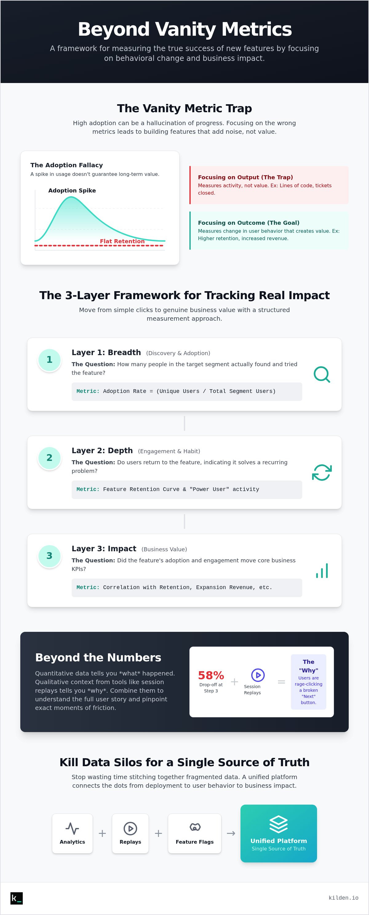
Many teams fall for the Adoption Fallacy. They see a 100% adoption rate and assume victory. This is a mistake. High adoption often just means your marketing worked or your UI forced users into a new path. It doesn't mean you solved a problem. If high adoption doesn't correlate with a specific Key Performance Indicator (KPI) like retention or expansion revenue, that feature is technical debt in disguise. You're paying to support code that provides no return. If a feature fails to drive retention or revenue, it's just expensive noise.
Stop confusing output with outcome. Output is the number of tickets closed and lines of code pushed. Outcome is the value created for the user. Learning how to measure feature success requires a shift in perspective. You must move from tracking "what we did" to "what happened because we did it." If you can't prove that your latest release solved a customer pain point, you're just guessing with the company's resources.
The Difference Between Usage and Utility
Total clicks is the most dangerous metric on your dashboard. It measures noise, not value. A user clicking a button ten times might be finding value; they might also be frustrated by a broken flow. You need to measure the "Aha! Moment" instead. This is the specific point where a user realizes the feature's utility. Distinguish between features users "have" to use, like a mandatory settings update, and those they "want" to use because it makes their lives easier. Utility drives retention; usage just fills logs.
Common Measurement Mistakes in 2026
Data silos are the enemy of clarity. Relying on raw event counts without qualitative context ignores the "why" behind the behavior. Another trap is measuring too early. The "novelty effect" often causes a temporary spike in engagement that disappears once the shine wears off. Finally, don't ignore the collateral damage. A new feature that boosts one metric while cannibalizing a core workflow isn't a win. Understanding how to measure feature success means looking at the whole system, not just the new button.
The 3-Layer Framework for Tracking Feature Adoption and Impact
Measurement without structure is just noise. To understand how to measure feature success, you need a hierarchy that separates simple discovery from genuine business value. We use a three-layer framework: Breadth, Depth, and Impact. This approach ensures you aren't just counting clicks, but actually quantifying the delta in user behavior. It moves your team from reactive reporting to proactive iteration. Stop guessing. Start measuring with a lean architecture that mirrors your product's logic.
Layer 1: Measuring Discovery and Initial Adoption
Breadth is your top-of-funnel for the feature. It answers a simple question: how many people in your target segment actually found the tool? You can't have success without discovery. Use in-app banners and product tours to guide users toward the new functionality. Track the adoption rate by dividing the number of unique users who triggered the feature by the total number of users in that specific segment. If discovery is low, the problem might be your UI placement rather than the feature's utility. Identify these friction points in the first-time user experience immediately to prevent a silent failure.
Layer 2: Evaluating Engagement and Habit Formation
Depth measures mastery. Usage doesn't mean a user has formed a habit. You need to calculate the Feature Retention Curve to see if users return to the feature after their initial interaction. Define what a "Power User" looks like for this specific tool. Is it someone who uses it daily, or someone who completes a complex multi-step workflow? Use session replay to watch how users navigate the flow. If they drop off at step three, you have a usability bug. Consolidating these insights into a single source of truth is easier when you use a unified product analytics platform that tracks the entire journey.
Layer 3: Connecting Usage to Business Outcomes
Impact is the final truth. This layer connects feature engagement to your North Star Metric. You must distinguish between correlation and causality. Does using this feature actually drive higher LTV, or are your highest-value users simply more likely to try new things? Compare the churn rates of users who adopted the feature against those who didn't. This is how to measure feature success at the executive level. Calculate the ROI of the engineering hours spent by comparing the development cost against the value created in retention or expansion revenue. If the impact is zero, the feature is a candidate for removal.
Beyond the Numbers: Adding Qualitative Context with Session Replay
Data tells you what happened. It shows a drop-off at step two. It doesn't tell you if the user was confused, bored, or angry. Session replay fills this gap. It provides the qualitative context that raw numbers lack. By watching real interactions, you identify "Rage Clicks" where users hammer a button that doesn't respond. You see "Dead Clicks" on elements that look interactive but aren't. This is the human side of how to measure feature success. Analytics show the path; replays show the struggle. Bridging the gap between quantitative events and user psychology is the only way to see the whole truth.
Why Analytics Alone Are Not Enough
Invisible friction is a silent killer. A user might complete a task but hate the process. They won't come back. Analytics record the completion but miss the frustration. This is why "Total Clicks" can be so deceptive. Use session replay to debug features with high initial discovery but zero retention. You might find that your "easy" three-step process actually takes five minutes of scrolling. Replays also reveal unintended use cases. Users often find clever, off-label ways to use your tools. If you only look at pre-defined events, you'll miss these opportunities for growth. Watching a user struggle for thirty seconds tells you more than a thousand rows of CSV data ever will.
In-App Surveys: Real-Time Sentiment Analysis
Capture sentiment at the moment of truth. Don't wait for an email survey three days later. Trigger in-app surveys immediately after a user completes a core action. This is the most accurate way to gauge the emotional impact of a release. Use micro-surveys to calculate a Feature Net Promoter Score (fNPS). Ask one simple question: "How easy was it to use this tool?" This creates a direct link between usage and satisfaction. Qualitative feedback serves as your roadmap for the next version. It tells you exactly what to fix before you waste more engineering time. Learning how to measure feature success requires balancing the hard data of clicks with the soft data of human emotion. Stop guessing what your users think. Ask them while they are still using the feature. This immediate feedback loop eliminates the bias of memory and gives you raw, honest input.
The Safe Rollout: Using Feature Flags to Measure Success
Big-bang releases are a gamble. They aren't a strategy. When you flip the switch for your entire user base at once, you lose the ability to isolate variables. You can't tell if a spike in engagement is due to your new feature or an external seasonal trend. This makes how to measure feature success nearly impossible because you've destroyed your control group. Feature flags change this. They turn a launch from a single event into a controlled experiment. They allow you to test your hypothesis in the real world without risking your entire business on a gut feeling.
The most effective way to prove value is through a "Holdout Group." By keeping a small percentage of users on the old version while everyone else moves forward, you create a permanent baseline. This allows you to measure the true incremental value of your work. If the group with the feature shows a 10% higher retention rate than the holdout group, you have definitive proof of success. Without this comparison, your data is just noise. You can start using feature flags with Kilden today to de-risk your next launch and gain this level of clarity.
Step-by-Step: From Feature Flag to Full GA
Moving from a local build to General Availability (GA) should be a methodical sequence of logical steps. Each stage must provide data that justifies the next. This is the core of how to measure feature success in a lean environment.
- Deploy the feature behind a flag to a small, internal group to catch obvious bugs.
- Expand to a 5% beta group of real users; monitor core stability and initial adoption metrics.
- Run a formal A/B test. Compare the new feature against the old workflow to identify the delta in user behavior.
- Analyze the results. If the data confirms your hypothesis, proceed to a 100% rollout. If not, kill it or iterate.
Managing Rollout Risks
Innovation requires risk, but that risk must be managed. Feature flags act as your "Kill Switch." If your success metrics trend negative or system latency spikes, you can revert the change instantly without a new code deploy. This protects the user experience while you debug the issue. You must monitor system performance alongside user behavior. A feature that users love but slows down the app is a net negative. Ensure your data integrity by segmenting your results. A feature might be a massive success for power users but a total failure for new signups. Only a unified view of flags and analytics can tell you the whole truth.
Closing the Loop: How Kilden Unifies Your Success Data
Tool fragmentation kills product teams. You spend more time stitching data together than you do building. When your analytics live in one tab, your session replays in another, and your feature flags in a third, you lose the narrative of the user journey. Kilden ends this fragmentation. By unifying these core tools into a single source of truth, you eliminate the friction of context switching. This is how to measure feature success without losing your mind. You see the "what" and the "why" in one interface. No silos. No guesswork. Just clarity.
Most platforms penalize your growth with per-seat licensing. We don't. We believe data should be accessible to every human who builds your product. Engineers, designers, and product managers all need access to the same truth to move fast. When your entire team can see the behavioral impact of their code, the quality of your output naturally improves. Kilden is the lean alternative to the bloated, expensive stacks that prioritize their billing cycle over your utility. We focus on movement, not maintenance.
The Power of One Identity
Stop looking at anonymous, disconnected events. Kilden provides a unified view of the user that bridges the gap between quantitative and qualitative data. You can see the exact person who responded to an in-app survey and jump directly into their session replay to see what caused their sentiment. This connection is vital. It allows you to see the frustration behind a low score or the delight behind a power user's workflow. You can also connect feature flag toggles directly to your analytics dashboards. If a new rollout causes a dip in conversion, you'll know in seconds. Context is everything.
Start Measuring What Matters
Setting up your first feature success dashboard in Kilden takes minutes, not weeks. Focus on the framework we established: Breadth, Depth, and Impact. Transition your team from "gut feel" to data-driven product decisions by making the results visible to everyone. You have the tools to see the truth of your product. Now you need the discipline to act on it. Build a culture of transparency where logic beats ego. It's time to trade your fragmented toolset for a streamlined reality. Stop guessing and start measuring with Kilden.
Stop Guessing and Start Building with Precision
The cost of the adoption fallacy is too high. Shipping code without a measurement plan isn't progress; it's a gamble with your engineering resources. By adopting a lean framework focused on breadth, depth, and impact, you gain the clarity needed to iterate with purpose. You now know how to measure feature success by bridging the gap between raw event data and human sentiment. Don't let your insights stay trapped in fragmented silos.
It's time to unify your product stack. Kilden provides a single source of truth that combines product analytics, integrated feature flags, and no-code in-app surveys. We eliminate the friction of jumping between tools and the unnecessary burden of per-seat licensing. You deserve a clear view of the delta in user behavior that actually creates business value. Measure feature success with Kilden, No per-seat licensing required.
Build with confidence. Every release is an opportunity to solve a real human problem. It's time to stop chasing vanity metrics and start delivering measurable impact. You have the framework; now use the right tools to execute.
Frequently Asked Questions
What is the most important metric for feature success?
Retention is the ultimate metric. High adoption means your marketing worked; high retention means your feature actually solved a problem. If users don't return to use the tool a second or third time, you haven't built utility. Focus on the delta in user behavior that correlates with long-term LTV. This is the only way to avoid the vanity metric trap and find the truth.
How long should I wait before measuring the success of a new feature?
Wait at least 30 days to see if a habit forms. Initial spikes are often just the novelty effect. People are curious; they'll click anything once. You need to look past the first week to understand how to measure feature success accurately. Give your users enough time to integrate the new tool into their actual daily or weekly workflows before drawing final conclusions.
How do I distinguish between feature adoption and feature discovery?
Discovery is a top-of-funnel event; adoption is a retention event. Discovery happens when a user clicks a banner or sees a new button for the first time. Adoption happens when that user completes a core action repeatedly over a set period. Tracking discovery tells you if your UI is effective. Tracking adoption tells you if your feature is actually useful to the human using it.
Can I measure feature success without an expensive analytics stack?
You don't need a bloated enterprise stack with per-seat licensing to get results. Unified platforms like Kilden combine analytics, session replay, and flags into one streamlined interface. This eliminates data engineering overhead and keeps costs predictable. Efficiency comes from clarity, not from how many tools you pay for. Focus on a single source of truth that everyone on the team can access.
What is a good feature adoption rate for a B2B SaaS product?
A healthy adoption rate typically falls between 20% and 40% for core features. However, don't chase a universal number. Success depends on the specific user segment you targeted. A feature designed for power users might have 10% adoption across your whole base but 90% adoption within that specific cohort. Always measure success against the intended audience rather than the total user count.
How do I handle a feature that has high usage but low satisfaction?
High usage paired with low satisfaction usually indicates a forced workflow. Users might have to use the feature to complete their jobs, but they hate the process. Watch session replays to identify invisible friction or rage clicks. If the data shows they are struggling, simplify the UI or remove unnecessary steps. Usage without satisfaction is just a precursor to churn.
Why should I use feature flags to measure success?
Feature flags allow you to isolate variables through holdout groups and A/B tests. Without a flag, you're rolling out to everyone and hoping for the best. With a flag, you can compare a control group against an experimental group to see the true impact on your KPIs. It's the most scientific way to determine how to measure feature success without external noise.
How do I align stakeholders on what "success" looks like for a roadmap item?
Define your success metrics before you start development. Stakeholders often demand reports after the fact, which leads to cherry-picking data. Force a conversation about the desired behavioral outcome early. If everyone agrees that success means a specific increase in retention for a target segment, the data becomes the final authority. This alignment prevents moving goalposts and keeps the team focused on value.