How to Improve User Onboarding: A Data-Driven Framework for SaaS Growth

on this page ▾
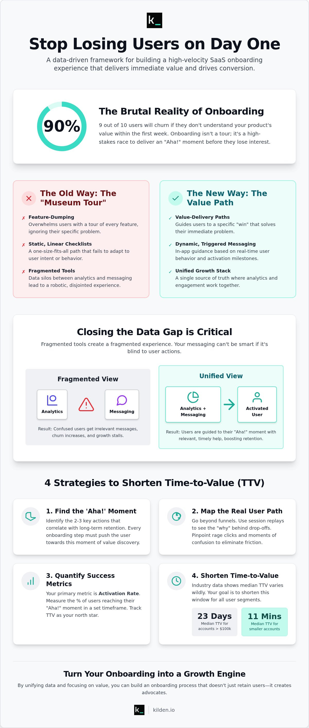
90% of users will churn if they don't understand your product's value within the first week. It's a brutal reality. Most SaaS companies treat onboarding like a polite museum tour when it's actually a high-stakes race. If you're struggling with high Day-1 drop-off rates, you're likely missing the "why" behind the data. You need to know exactly how to improve user onboarding before your trial users lose interest. Fragmented tools that don't talk to each other only make the problem worse.
We agree that guessing isn't a strategy. You're tired of seeing users hit a wall without knowing which feature caused the friction. This article promises to help you stop the guesswork. You'll learn to build a high-velocity onboarding path that delivers immediate value. We're moving past static checklists to a unified view of user behavior. We'll preview a data-driven framework designed to reduce Time to Value (TTV) and drive higher trial-to-paid conversions. It's time to turn your onboarding into a growth engine.
Key Takeaways
- Stop feature-dumping. Build value-delivery paths that respect user time and technical intelligence.
- Discover how to improve user onboarding by using session replay to pinpoint exactly where users drop off.
- Replace static, linear tours with dynamic in-app messaging triggered by real-time behavioral data.
- Define clear activation milestones to reduce time-to-value and drive higher trial-to-paid conversions.
- Close the data gap. Unify analytics and engagement tools into a single source of truth for your growth team.
Table of Contents
- Why Most SaaS Onboarding Fails: The 'Empty Room' Problem
- Mapping the Path: Using Data to Find Drop-Off Points
- Static Tours vs. Dynamic Engagement: Choosing the Right Lever
- A 5-Step Framework to Improve User Onboarding
- Unified Growth: How Kilden Closes the Onboarding Loop
Why Most SaaS Onboarding Fails: The 'Empty Room' Problem
Most SaaS onboarding fails because it treats the user like a tourist. You provide a map of every feature you've ever built. The user doesn't care. They have a specific problem. They want a specific result. When you dump features instead of delivering value, you create the 'Empty Room' problem. A user signs in, sees a blank dashboard, and feels the weight of a learning curve they didn't ask for. This is where curiosity turns into frustration.
Onboarding is a race against the clock. We measure this with Time to Value (TTV). Industry data shows that for accounts worth over $100,000, the median TTV is 23 days. For smaller accounts, it's often as low as 11 minutes. If you want to know how to improve user onboarding, start by shortening that window. A 'one-size-fits-all' tour is a recipe for churn because it ignores the user's unique intent. You must guide them to a win, not a walkthrough.
Some industry voices claim all friction is the enemy. This is a mistake. Unnecessary clicks are bad; educational friction is necessary. If a user needs to connect a data source to see value, that's a hurdle you must help them clear, not ignore. The goal is clarity, not just fewer buttons.
The Hidden Cost of Fragmented Onboarding Tools
Data silos are the silent killers of a good first impression. When your product analytics live in one tool and your in-app messaging lives in another, you have an identity crisis. Your messenger doesn't know the user just finished a task. It sends a "how-to" tip for a feature they've already mastered. It feels automated and robotic. Engineering teams also suffer. They dread hard-coded onboarding flows that require a sprint cycle just to change a single tooltip. Fragmented tools lead to fragmented experiences.
Identifying Your Product's 'Aha!' Moment
You don't need to teach the whole product on day one. You need to identify the two or three actions that correlate with long-term retention. Use your data to find these milestones. The 'Aha!' moment is the point where the user's problem meets your solution. Once you find it, work backward. Every step in your sign-up funnel should exist only to push the user toward that moment. If a step doesn't serve that goal, it's a distraction. Strip it away. Focus on the path to activation, not the list of features.
Mapping the Path: Using Data to Find Drop-Off Points
Traditional funnel charts are incomplete. They tell you that 40% of users drop off at the second step, but they don't explain why. To understand how to improve user onboarding, you must track every granular interaction. A basic funnel might show "Sign Up" followed by "Invite Team." A high-velocity funnel tracks the email verification, the workspace naming, and the exact second they invite a colleague. If users stall at workspace naming, your UI is likely too demanding too early. Mapping these micro-steps reveals the truth about where momentum dies.
Ghost features are the silent killers of momentum. These are steps that seemed like a good idea in a product meeting but add zero value to the user's immediate goal. If an onboarding step doesn't lead directly to an activation milestone, delete it. Every extra click is an exit opportunity. Segment your users by intent immediately. A developer wants an API key; a marketer wants a dashboard. Forcing them into the same path ensures at least one of them will churn. Knowing how to improve user onboarding starts with removing the noise.
Stop guessing about UI friction. When you integrate session replay with product analytics, you see the "why" behind the bounce. You'll spot rage clicks on buttons that don't respond or dead-ends where users circle their cursor in confusion. This isn't just about bugs. It's about spotting the moment the user loses the thread of your value proposition. Use this behavioral data to prune your funnel until only the fastest path to value remains.
Beyond Funnels: Seeing Onboarding Through Your User's Eyes
Metrics show the result, but session recordings show the struggle. Focus on the first five minutes. This is where most churn happens. Distinguish between technical friction, like a slow-loading integration, and conceptual friction, where the user simply doesn't understand the next step. If a user spends three minutes on a settings page that should take thirty seconds, your documentation or UI has failed them. Fix the concept, not just the code.
Quantifying Onboarding Success Metrics
Your primary metric is the activation rate. This is the percentage of users who reach their specific 'Aha!' moment within a defined timeframe. While trial-to-paid conversion is the ultimate goal, it's a lagging indicator. You can't fix a payment problem that started ten days ago in onboarding. Use in-app surveys to gather immediate qualitative data. Ask a simple question: "Did you find what you were looking for?" The answer tells you more than a thousand page views ever could.
Static Tours vs. Dynamic Engagement: Choosing the Right Lever
Modern users have developed a reflex for clicking the "Skip" button. Linear product tours that force a user through ten steps of UI highlights are a relic of the past. They ignore the user's immediate intent. If someone signs up to build a report, don't show them how to edit their profile settings. This disconnect is why static tours are often ignored. They feel like homework. To understand how to improve user onboarding, you must shift from teaching the interface to enabling the workflow.
Dynamic engagement relies on behavioral triggers. Instead of a one-size-fits-all sequence, use in-app banners for non-intrusive guidance. A subtle banner can nudge a user toward a secondary feature without blocking their screen. When you need to make larger structural changes to your flow, use Feature Flags. These allow you to roll out new onboarding experiments to small cohorts safely. You can measure the impact on activation before committing to a full launch. It's a methodical approach to growth that prioritizes data over assumptions.
The Case for Contextual Product Tours
Context is the difference between help and spam. Trigger your tooltips based on what a user hasn't done yet. If a user has been on the dashboard for two minutes without clicking "Create Project," that's the moment for a targeted nudge. Keep these tours short. Follow the three-step maximum rule for engagement. Any longer and you risk losing their attention. Design for 'Learn-by-Doing' instead of 'Learn-by-Watching.' Users retain more information when they actually perform the action while the guide is active. This is how to improve user onboarding through active participation.
In-App Messaging: The Bridge to Re-Engagement
Onboarding doesn't always happen in one session. Use targeted campaigns to bring dormant users back into the product. If a user drops off before reaching an activation milestone, an automated message can highlight the specific value they missed. Your in-app messenger should also act as a real-time support channel during complex setups. It provides a safety net for users who hit a wall. In-app messaging must be triggered by real-time behavioral data rather than arbitrary timers to ensure the content remains relevant to the user's current state. This unified approach ensures your messaging feels like a helping hand, not a distraction.
A 5-Step Framework to Improve User Onboarding
Most growth frameworks are too theoretical. They talk about "value" without explaining how to measure or deliver it. Generic strategies fail because they lack the technical 'how-to' for implementation. You need more than a checklist; you need a system that detects friction and resolves it instantly. To truly understand how to improve user onboarding, you must build a technical protocol that bridges the gap between what users do and what you want them to do. This five-step framework replaces intuition with a repeatable cycle of observation and action.
Step 1 & 2: Finding the Friction and the Value
Start with a session replay audit of your top 50 drop-off sessions. Numbers show you the exit; recordings show you the wall. You'll likely find a mismatch between your 'Happy Path' and the 'Reality Path.' The 'Happy Path' is your design team's dream. The 'Reality Path' is the messy sequence of clicks users actually take. Identifying this gap allows you to define core activation milestones. These aren't just page views. They are high-intent actions, like "First Data Export" or "Team Member Invited," that correlate with long-term retention. Set clear, measurable goals for each step. If a step doesn't lead to a milestone, it's a distraction. This audit reveals technical bugs, UI confusion, and the exact moment a user gives up.
Step 3, 4 & 5: Engaging, Listening, and Refining
Once milestones are defined, deploy contextual product tours to guide users toward them. Don't use a hammer for every nail. Test different messaging formats based on the friction level. Banners work for non-critical tips. Modals are for 'stop-and-look' moments. Tooltips provide surgical precision for complex buttons. After a user interacts with these elements, trigger in-app surveys. Qualitative data from a user who just finished a task is 10x more accurate than a retrospective email survey. Use this feedback to iterate. Onboarding is never finished. Every new feature release requires its own mini-onboarding flow. This 'Continuous Onboarding' mindset ensures that long-term users don't get left behind as the product evolves. You can use Kilden to unify your analytics and engagement to see exactly how to improve user onboarding through real-time behavioral data.
Unified Growth: How Kilden Closes the Onboarding Loop
Most SaaS teams are drowning in tool sprawl. They use one platform for analytics, another for session replay, and a third for in-app messaging. These tools live in silos. They don't share data in real-time. This creates a fragmented experience for the user and a nightmare for the growth team. To understand how to improve user onboarding, you have to eliminate the 'Data Gap'. Kilden unifies these functions into a single source of truth. You see the behavior and you take action in the same interface. No more waiting for data syncs between disconnected platforms.
Scaling shouldn't be a financial burden. Many competitors rely on per-seat licensing models that punish you for growing your team. Kilden eliminates this friction. We provide a platform where your entire team can collaborate on growth without worrying about seat counts. You get access to product analytics, feature flags, and campaigns in one place. It moves you from insight to action in seconds. This is the most direct path to a high-velocity onboarding flow.
One Identity, Zero Silos
Having session replay and product tours in one tool is a game-changer. When a user gets stuck, you don't just see a drop-off in a funnel; you see the actual recording of their confusion. You can then trigger a contextual tooltip or a product tour specifically for that user segment. This reduces the 'Tax' on your engineering team. You don't need a developer to hard-code every nudge. Use our no-code engagement tools to iterate on the fly. Read more about The Hidden Cost of Data Silos to see how fragmentation kills conversion.
Getting Started with Kilden
Setting up your first campaign takes minutes, not weeks. Install the snippet and start tracking your activation milestones immediately. Use in-app surveys to ask users about their experience while they are still in the product. This qualitative data builds a better roadmap than any internal brainstorm. Stop guessing why users leave. Start improving your onboarding with Kilden for free and build a path that delivers value from the first click. Knowing how to improve user onboarding is about having the right data and the right tools in one hand.
Drive Growth Through Behavioral Clarity
The 'Empty Room' problem is solved when you stop guessing and start observing. You now have the framework for how to improve user onboarding by mapping the path and choosing dynamic engagement over static tours. Success isn't about more features; it's about faster value. Delivering that value requires a technical stack that works as hard as your product.
Fragmented tools create a tax on your growth. When your analytics don't talk to your messaging, you lose the "why" behind the data. Kilden eliminates this friction. We provide a unified analytics and messaging platform with integrated session replay and product tours. There is no per-seat licensing to slow you down. It's a single source of truth for your entire team to act on behavioral insights instantly.
Don't let another cohort churn because they couldn't find the activation moment. Build a better onboarding experience with Kilden. You have the data. You have the framework. Now, take the lead and turn your trial users into loyal partners.
Frequently Asked Questions
What is the most important metric for user onboarding?
The activation rate is the single most critical metric. It measures the percentage of new users who complete a specific, high-value action within your product. While sign-ups feel good, they don't drive revenue. Focus on the 'Aha!' moment where the user first finds value. If users don't reach this milestone quickly, they churn. Track this over time to see if your onboarding changes actually move the needle.
How long should a SaaS product tour be?
Keep your product tours to a maximum of three steps. Modern users have zero patience for long, multi-page walkthroughs. They want to solve a problem, not watch a presentation. If a feature needs ten tooltips to explain, the UI is the problem. Use contextual triggers to show only what is relevant to the user's current task. Short, punchy interactions beat long tours every time.
Can I improve onboarding without writing code?
You can absolutely learn how to improve user onboarding without a single line of code. Modern platforms allow you to deploy product tours, in-app banners, and surveys through a visual editor. This eliminates the 'engineering tax'. Your growth team can experiment and iterate in hours rather than waiting for the next development sprint. It puts the power of optimization directly into the hands of those tracking the behavioral data.
What is the difference between user orientation and user onboarding?
Orientation is a tour of the interface. Onboarding is a journey toward value. Orientation tells a user where the "Settings" button is. Onboarding ensures they successfully integrate their first data source. One is passive; the other is active. Most companies fail because they stop at orientation. True onboarding requires guiding the user through the specific actions that correlate with long-term retention and success.
How do I identify where users are dropping off in my sign-up funnel?
Start by building a granular funnel that tracks every click in the sign-up process. This shows you the "what." To find the "why," use session replay to watch recordings of users who dropped off at specific steps. You'll often see UI confusion or technical errors that data alone misses. Combining these two insights allows you to pinpoint and fix the exact friction points killing your conversion rate.
Should I use email or in-app messaging for onboarding?
Use in-app messaging for real-time guidance while the user is active. It's the most effective way to drive immediate action. Reserve email for re-engagement when a user has gone dormant. An in-app banner is relevant because it's contextual. An email is a distraction unless it's pulling them back to a specific task. Balance the two to ensure you're supporting the user without cluttering their inbox.
What are the best tools for SaaS user onboarding in 2026?
The best tools in 2026 are unified platforms that eliminate data silos. You need a system that offers product analytics, session replay, and in-app messaging in one interface. This allows for instant, data-triggered actions. Avoid fragmented tool stacks that require complex integrations. Looking for a single source of truth is how to improve user onboarding efficiently. Kilden provides this wholeness without the burden of per-seat licensing.
How do I measure the ROI of onboarding improvements?
ROI is measured by the lift in your trial-to-paid conversion rate. When you shorten the time-to-value, users are more likely to upgrade to a paid plan. You should also see a decrease in Day-1 and Day-7 churn. Calculate the lifetime value of the additional users you've retained. Compare this against the cost of your onboarding tools. The math usually favors a streamlined, data-driven approach that prioritizes user activation.