How to Build a Product Metrics Dashboard That Triggers Action (2026 Guide)


on this page ▾
Most product metrics dashboards are graveyards for data. You've seen the charts. They look impressive in a quarterly review, yet they fail to trigger a single meaningful change in your roadmap. You're likely juggling three different tools just to understand why a user dropped off a funnel. It's inefficient. It's expensive. Most importantly, it's a waste of your team's technical intelligence.
You know the pain of data silos where analytics and user feedback never meet. You're tired of paying per-seat for visibility that every developer and PM needs to see. It shouldn't be this hard to get a clear signal from your stack. This 2026 guide changes that. You'll learn how to transform stagnant numbers into a decision-driving engine that connects user behavior directly to in-app growth. We'll provide a framework for choosing metrics that actually matter and show you how to build a unified view of the entire user journey. It's time to see the human story behind the data and stop the context switching tax for good.
Key Takeaways
- Stop building reporting hubs that collect dust. Learn to build decision engines that mandate specific interventions the moment a metric slips.
- Identify your North Star metric. Map it across the user journey to ensure every part of your product metrics dashboard connects directly to real growth.
- Ditch vanity metrics. Focus on activation and feature adoption rates to understand where users find value and where they get stuck.
- Stop guessing why users drop off. Integrate session replays and "rage click" alerts to add human context to your quantitative numbers.
- Close the loop instantly. Use feature flags and in-app messaging to fix product issues the moment your data identifies a friction point.
Table of Contents
- Stop Building Reporting Hubs; Start Building Decision Engines
- Step 1: Mapping Your Dashboard to the User Journey
- Step 2: Selecting the Actionable Metrics That Matter
- Step 3: Integrating Qualitative Context (The "Why" Behind the "What")
- Step 4: From Insight to Execution in One Platform
Stop Building Reporting Hubs; Start Building Decision Engines
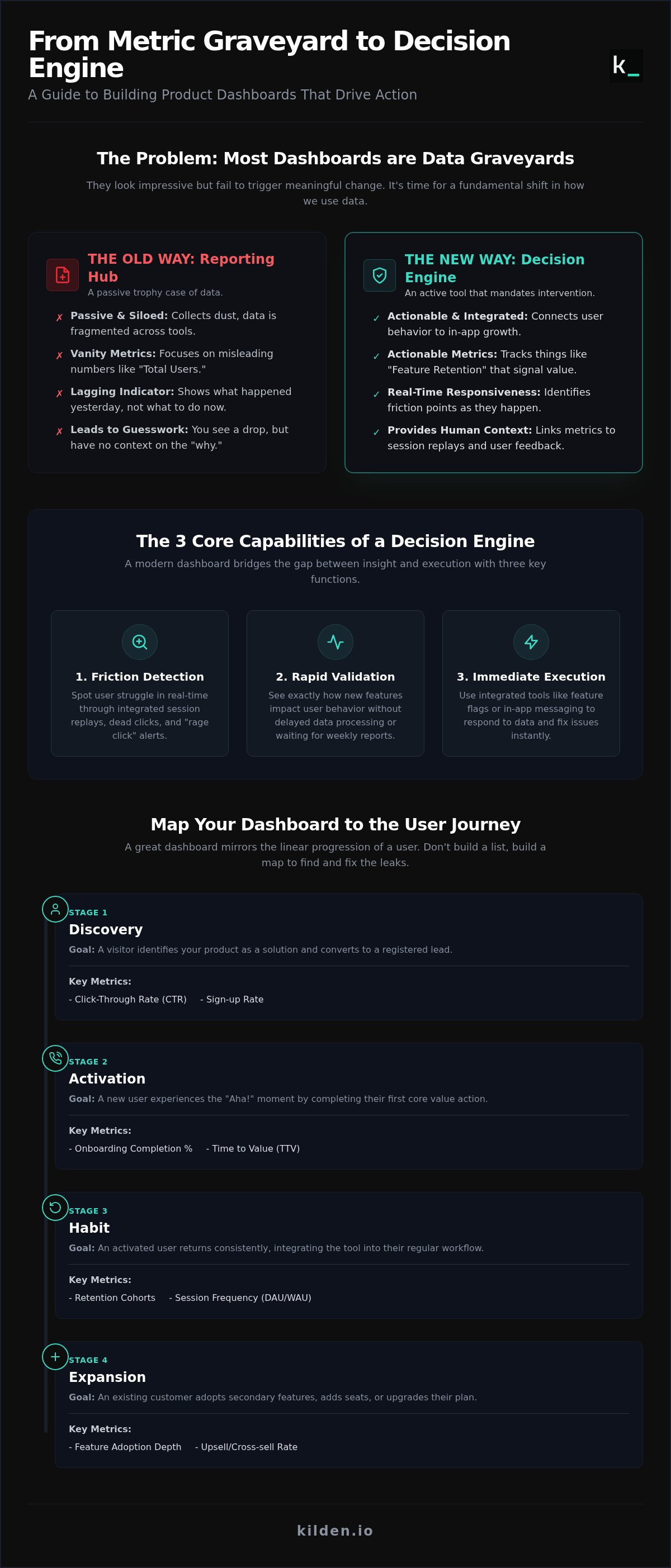
Most teams treat their product metrics dashboard like a trophy case. It's a collection of high-level numbers meant to soothe stakeholders during a weekly sync. This is a reporting hub. It's passive. It's safe. It's also largely useless for driving growth. While business dashboards have historically provided a broad overview of health, modern product teams need something more surgical.
You need a decision engine. A decision engine doesn't just show you that 500 people signed up yesterday; it mandates an intervention. If activation drops by 12% among users who skipped the onboarding tour, the dashboard should make that failure impossible to ignore. In 2026, real-time responsiveness is the only competitive advantage left. The global product analytics market is expected to hit $13.04 billion this year because companies are finally realizing that speed is a feature. Weekly reporting cycles are dead. If you wait for a Monday meeting to address a Friday drop-off, you've already lost the user.
The distinction lies in the metrics you choose. Total users is a vanity metric. It only goes up, providing a false sense of security. Feature retention is an actionable metric. It tells you if your product actually works. If a metric doesn't have a pre-defined "threshold for action," it shouldn't be on your primary view. If "Daily Active Users" drops by 5%, what is the immediate, documented response? If you don't have an answer, that chart is just noise.
Why Most Dashboards Are Just "Metric Graveyards"
The "All-in-One" dashboard is a trap. It tries to please the CEO, the PM, and the Engineer simultaneously, resulting in a cluttered mess where the signal is buried under 40 different widgets. The real killer is the data silo. When your analytics live in one tool and your messaging lives in another, you lose the "humanity" of the data. You see a drop in a funnel but have no way to see the session replay or trigger an in-app banner to guide the user. Fragmented identity means your metrics don't actually know your users. They just know their events.
The One Job of a Product Metrics Dashboard
A high-impact product metrics dashboard has one job: to bridge the gap between insight and execution. It should identify friction points before they become churn statistics. Instead of waiting for a monthly report, you should see "rage clicks" on a new feature in real-time. This allows you to validate hypotheses in hours. A functional dashboard provides three core capabilities:
- Friction Detection: Spotting user struggle through integrated session replays and dead clicks.
- Rapid Validation: Seeing exactly how new features impact user behavior without delayed data processing.
- Immediate Execution: Using integrated tools like feature flags or in-app messaging to respond to the data immediately.
By democratizing this data without per-seat licensing, you empower every team member to act on the truth without waiting for a gatekeeper to run a query. You stop guessing why users are leaving and start fixing the journey in the same platform where you found the problem.
Step 1: Mapping Your Dashboard to the User Journey
Don't build a list. Build a map. A product metrics dashboard that ignores the sequence of user behavior is just a collection of random facts. It lacks narrative. To drive action, your dashboard must mirror the linear progression of a human using your software. If you can't see the handoff between stages, you can't fix the leaks.
Break your journey into four milestones. Assign specific metrics to each to ensure you aren't flying blind. Here is the framework:
- Discovery: User identifies a solution. Success: A visitor converts to a registered lead. (Metrics: CTR, Sign-up rate).
- Activation: User reaches the "Aha!" moment. Success: A new user completes their first core value action. (Metrics: Onboarding completion, Time to Value).
- Habit: User returns consistently. Success: A user integrates the tool into their weekly workflow. (Metrics: Retention cohorts, session frequency).
- Expansion: User does more or pays more. Success: An existing customer adopts secondary features or adds seats. (Metrics: Feature depth, upsell rate).
The North Star vs. Supporting Signals
Revenue is a distraction. It's a lagging indicator that tells you what happened last month, not what will happen next. Your North Star Metric must track value realization. For early-stage SaaS, Time to Value (TTV) is the only metric that matters. If it takes three days for a user to see a result, they're already gone. High-performing teams balance customer and business value by monitoring leading indicators that predict future revenue. Watch out for false positives. High session frequency might look like engagement, but if session length is under thirty seconds, it's a sign of a confused user, not a happy one.
Segmenting by Lifecycle Stage
A unified view is useless if it mixes new sign-ups with five-year veterans. You must segment. For new users, focus entirely on the "Aha! Moment." If they don't hit it, nothing else matters. For power users, track feature depth. Are they using your advanced automation or just the basic reporting? Finally, watch your at-risk users. Churn doesn't happen at the cancellation screen. It happens weeks earlier during the "Silence Before the Storm." When login frequency drops, that's your signal to intervene. To see these segments clearly without the "context switching tax," you should unify your analytics and messaging under a single identity. It's the only way to move from seeing a problem to solving it.
Step 2: Selecting the Actionable Metrics That Matter
Selection is an act of exclusion. If your product metrics dashboard tries to track every event, it will fail to highlight the ones that actually drive growth. You don't need more data; you need better filters. Actionable metrics are those that, when they move, require you to change your behavior. If a number drops and your team stays silent, that number doesn't belong on your screen.
Focus on four core pillars to maintain clarity. First, Activation Rate. This isn't just a signup; it's the percentage of users who reach your core value proposition. Second, Feature Adoption Rate. You need to know which parts of your product are actually being used and which are just digital clutter. Third, User Retention Cohorts. This allows you to track how specific groups of users stick around over time, revealing if your product is improving or stagnating. Finally, monitor Net Churn. This is the ultimate financial truth of your product. It accounts for user exits alongside expansions, showing you if your existing base is finding enough value to pay more.
Acquisition and Activation Metrics
The signup-to-activation funnel is where most products bleed out. You must identify the specific drop-off point where users lose interest. Is it the third step of the registration? Is it the empty state after they first log in? Use your dashboard to map the "Happy Path" through your product tours. If users who complete the tour have a 40% higher activation rate, you know where to focus your engineering muscle. You can also measure the impact of in-app banners on feature discovery. If a banner doesn't move the needle on activation within 48 hours, kill it and try a different hook.
Feature Adoption and Engagement Depth
Engagement is often a vanity metric until you break it down into breadth and depth. Breadth tells you how many users found a feature. Depth tells you how often they use it. If a feature has high breadth but low depth, people are curious but not convinced. You also need to track Time to First Action. This is the modern version of Time to Value. How long does it take for a user to "get it"? In 2026, user patience is at an all-time low. If a user doesn't perform a core action within their first session, the likelihood of them returning drops significantly. Your dashboard should flag these "slow starts" so you can trigger an intervention before they become a churn statistic.
Step 3: Integrating Qualitative Context (The "Why" Behind the "What")
Data without context is dangerous. You see a 10% drop in activation on your product metrics dashboard and assume your marketing is off. In reality, a CSS bug might be hiding the "Continue" button on mobile. Quantitative data tells you that something happened. Qualitative data tells you why. If your dashboard doesn't bridge this gap, you're just guessing.
Traditional analytics tools treat session replays as a separate "add-on" or a different tab entirely. This is a mistake. To build a decision engine, your metrics must be the trigger for visual investigation. When activation slips below your action threshold, you shouldn't need to hunt for the cause. A 10% drop in activation should immediately trigger a review of the latest session replays to identify the friction.
To make this actionable, use "Rage Clicks" and "Dead Clicks" as dashboard alerts. A rage click occurs when a user clicks a specific element rapidly, signaling frustration. A dead click happens when a user clicks an element that has no effect. These aren't just UX nuances; they are leading indicators of churn. When these alerts spike, your dashboard is telling you exactly where the product is failing the human behind the screen.
Why Numbers Without Session Replays Lie
A "completed signup" event looks like a success in a spreadsheet. It doesn't show the five minutes of struggle it took to get there. It misses the confusing form validation and the three attempts at a password before the user finally broke through. These are UX bugs that standard analytics miss entirely. Seeing the struggle builds empathy in engineering teams. It moves the conversation from "the data says" to "I saw the user fail." It's hard to ignore a video of a customer stuck in a loop.
Closing the Feedback Loop with In-App Surveys
Surveys are often annoying because they're poorly timed. They ask for feedback three days after the user has forgotten the experience. Instead, trigger in-app surveys based on specific dashboard events. Ask "How was this setup process?" the moment a user completes their first feature use. This captures qualitative data at the point of peak engagement.
The real power comes from unity. You shouldn't have to cross-reference a survey tool with an analytics platform. Using Kilden, you can see the survey response and the exact session recording in one view. This eliminates the "context switching tax" and gives you the whole truth instantly. If you're ready to stop guessing and start seeing, you should integrate session replay and surveys into your analytics stack today.
Step 4: From Insight to Execution in One Platform
A dashboard that only reports is a cost center. To drive growth, your product metrics dashboard must function as a control center. Most teams identify a friction point in their analytics tool, then spend hours or days coordinating a fix in a separate messaging or development platform. This delay is where users are lost. In 2026, the gap between seeing a problem and solving it should be seconds, not sprints.
The Kilden advantage is simple: one platform and one identity. We eliminate the data silos that force you to guess which user did what. When your analytics, session replays, and feature flags live in the same house, you stop paying the "context switching tax." You move from staring at a chart to changing the user experience in real-time. This is the difference between a passive observer and a decisive leader.
Breaking Down the Silo Between Analytics and Messaging
Stop treating analytics and engagement as separate disciplines. When your dashboard shows a user stalling at the Activation milestone, the system should respond. You can deploy an automated in-app message or a product tour to guide them through under-utilized, high-value features. This isn't just automation; it's real-time personalization based on actual behavioral data. Because we use a unified identity for every interaction, the message knows exactly what the user did five seconds ago. This no-code intervention allows you to fix funnels without waiting for a developer or opening a Jira ticket.
Deploying Feature Flags Directly from Dashboard Data
Feature flags are the ultimate safety net for experimentation. You can A/B test feature variants based on live retention metrics directly from your dashboard. If the stability metrics go red during a rollout, you roll back the flag instantly. There is no deployment cycle and no emergency engineering ticket. This removes the "Managed Data Engineering" tax that plagues fragmented stacks. You get a lean, minimalist architecture that prioritizes movement and user truth.
Data is only useful if the people who need it can see it. Many legacy tools charge per-seat, which forces teams to ration access. This creates gatekeepers and slows down decision-making. We democratize access. By removing per-seat friction, every developer, PM, and support agent sees the same human truth. One platform. Total transparency. Total agility.
Stop Reporting and Start Growing
Your data shouldn't be a spectator sport. A high-impact product metrics dashboard is only as good as the interventions it triggers. You've learned how to map the user journey, isolate the metrics that actually move the needle, and layer in the "why" with session replays. The era of fragmented tools and context switching taxes is over. Success in 2026 requires a unified view where insight leads directly to execution without a three-week development cycle. If your current stack feels like a graveyard of charts, it's time to rebuild.
Don't let data silos or per-seat licensing throttle your team's agility. You need a system that connects user behavior directly to in-app growth. Build your unified product metrics dashboard with Kilden; no per-seat licensing required. We bring Analytics, Replay, and Engagement together under one identity. It's trusted by growth teams worldwide to eliminate guesswork and prioritize utility. Stop paying for seats and start making decisions today. Your users are moving fast. It's time your platform kept up.
Frequently Asked Questions
What is the most important metric for a product metrics dashboard?
The most important metric is your North Star. This must represent core value realization for the user, not just a business goal like revenue. Focus on leading indicators such as Activation Rate or Time to Value. If a metric doesn't show a human finding success in your app, it doesn't belong on your primary view. Leading indicators predict future retention while lagging indicators only report the past.
How often should a product team review their metrics dashboard?
Check high-level health daily, but conduct deep-dive action reviews weekly. Real-time alerts for rage clicks or funnel drops should be monitored constantly via automated triggers. Don't wait for a monthly reporting cycle to identify friction. In 2026, user patience is too thin for slow responses. If a metric hits a pre-defined threshold for action, your team must intervene immediately to prevent churn.
Can I build a product metrics dashboard without a data engineer?
Yes, if you use a unified platform that handles identity mapping and event tracking automatically. Modern tools eliminate the need for complex data engineering by providing a single SDK for analytics, session replays, and messaging. This democratization allows PMs and designers to build their own views. You can see the truth of the user journey without waiting for a technical gatekeeper to write custom SQL queries.
What is the difference between a product dashboard and a business BI dashboard?
A product metrics dashboard focuses on behavioral "how" and "why," while a BI dashboard focuses on the financial "what." BI tools track MRR and LTV for stakeholders. Product dashboards track feature adoption and friction points for builders. One reports on historical performance; the other guides the immediate future of the software. You need behavioral data to change the product, not just report its cost.
How do I know if my product metrics are actually actionable?
Ask one question: "If this number drops by 10% tomorrow, exactly what will we do?" If you don't have a documented response, the metric is just vanity. Actionable metrics mandate a specific intervention, such as rolling back a feature flag or triggering a product tour. Every chart on your screen must have a clear threshold for action. If you can't act on the data, stop tracking it.
Why should I combine session replay with my metrics dashboard?
Numbers provide the "what," but replays provide the "why." A funnel drop is just a statistic until you watch a user struggle with a broken button or confusing UI. Combining these tools under a unified identity allows you to jump from a quantitative signal to a qualitative truth instantly. It builds empathy in engineering teams. Seeing a user fail is more persuasive than any spreadsheet or chart.
How can I reduce the cost of product analytics for a large team?
Stop using tools that charge per-seat licensing. These models punish you for being collaborative and transparent. Switch to a platform that prioritizes data democratization by allowing unlimited users. This ensures every developer and PM has access to the truth without ballooning your monthly spend. Focus on paying for data volume rather than the number of people who need to see it to do their jobs.