Why Users Drop Off Your Sign-Up Funnel: 5 Dangerous Myths Debunked


on this page ▾
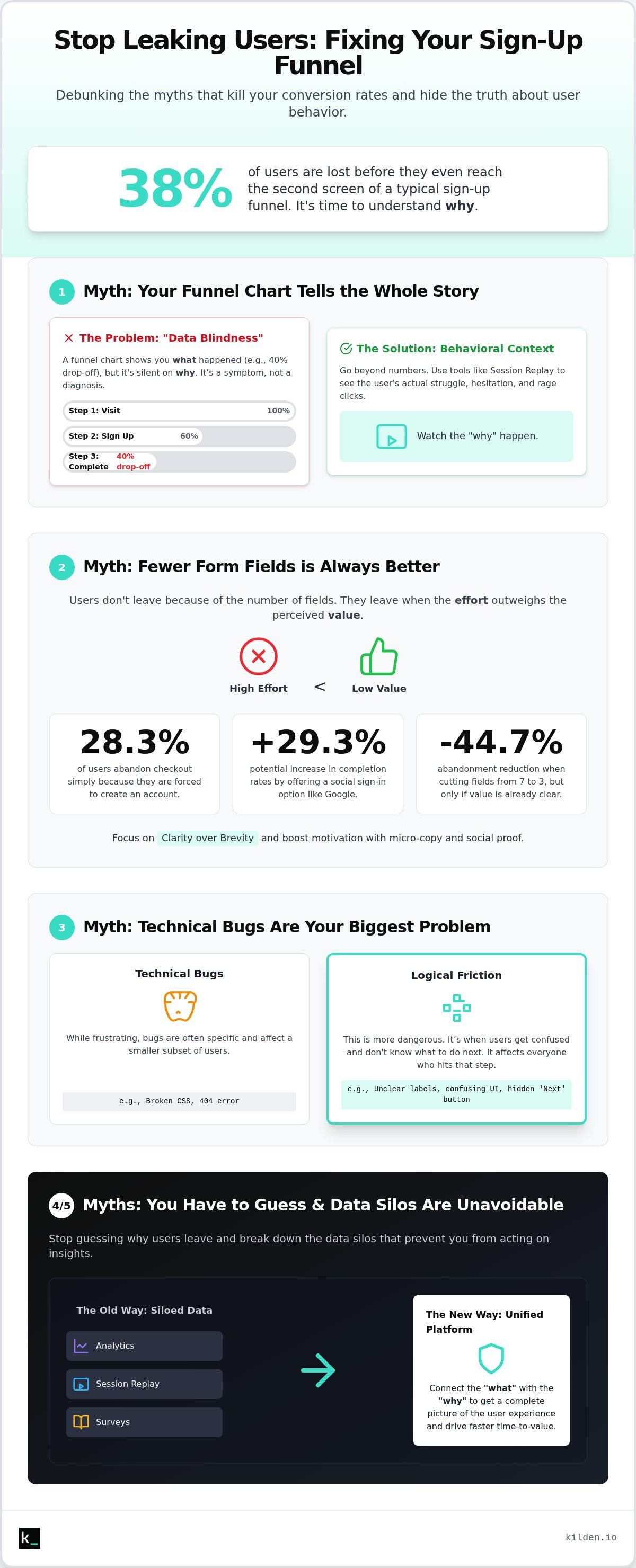
Your sign-up funnel is likely losing 38% of its users before they even reach the second screen. It's a brutal reality. You're burning through budget on high customer acquisition costs only to watch potential customers vanish into a digital void. We've all been there. You feel the pressure from stakeholders to "just fix the funnel," yet you're stuck staring at data silos that offer no real answers. You know exactly where the leaks are, but you don't know the cause.
Understanding why users drop off sign up funnel shouldn't involve guesswork or endless A/B tests on button colors. It requires a shift from tracking metrics to observing human behavior. We're here to stop the bleeding. In this guide, we debunk five dangerous myths that keep your conversion rates stagnant. You'll learn a clear framework for diagnosing UX friction and gain the data-driven context needed to drive faster time-to-value for every new user. It's time to trade fragmented theories for the ground truth of your user experience.
Key Takeaways
- Stop treating funnel charts as a diagnosis. They are a symptom. Learn to look past the percentages to find the actual behavioral blockers.
- Fewer fields won't save a broken value proposition. Master the "Value vs. Effort" equation to understand why users drop off sign up funnel.
- Logical friction is more dangerous than technical bugs. Identify exactly where users lose momentum because they don't know what to do next.
- Silence isn't an answer. Use in-app surveys and session replay to capture the "Why" behind every exit in real-time.
- Kill the data silos. See how a unified stack of analytics and engagement tools streamlines the path from insight to action.
Table of Contents
- The Metric-Only Trap: Why Your Funnel Chart Is Lying to You
- The Short Form Fallacy: Why Fewer Fields Won’t Save Your Conversion
- The Technical Bug Obsession: When UX Friction Outweighs Errors
- The Silent Abandonment Myth: Why You Don’t Have to Guess
- The Kilden Approach: Unifying Insight and Action
The Metric-Only Trap: Why Your Funnel Chart Is Lying to You
Your conversion funnel isn't a pipeline; it's a sieve. Most product teams treat their analytics dashboard as an absolute record of reality. This is a mistake. A funnel chart shows you the results of failure, but it remains silent on the cause. When your data indicates a 40% drop-off at Step 2, you're looking at a symptom. It's the digital equivalent of a high fever. You know the patient is sick, but you don't know if it's a virus or a broken leg. This is the "Metric-Only Trap." It creates a culture of guessing where stakeholders demand fixes for problems that haven't been diagnosed. This "Data Blindness" is often caused by siloed tools. Your analytics tell you "what" happened, but your messaging platform is disconnected from the "why." This fragmentation is the core reason why users drop off sign up funnel stages without leaving a trace of their frustration.
The Problem with Averages and Aggregates
Averages are the enemy of clarity. They hide individual user frustrations behind a wall of high-level percentages. Aggregated data cannot tell you if a user was genuinely confused or simply distracted by a Slack notification. It treats a technical error and a lack of motivation as the same data point. If you spend three hours staring at a declining line graph, you still won't find the broken button or the misaligned CSS. The problem is invisible at scale. You see a trend; you miss the rage click. You see an exit; you miss the five seconds of hesitation before a user gives up on a poorly labeled field. Stop optimizing for the average and start solving for the human. It is the only way to move from observation to meaningful action.
The Power of Behavioral Context
To fix the funnel, you need the truth. You need behavioral context. Using session replay software acts as the CCTV for your sign-up process. It provides the visual evidence that raw numbers lack. Seeing a single user struggle to find the "Next" button provides more insight than 1,000 data points on a heat map. This shift from guessing to knowing is transformative. It eliminates the need for endless A/B tests that only move the needle by fractions. When you watch a replay, the friction is obvious. The logical blockers become visible. You stop arguing about UI theory and start acting on reality. This is how you identify the real behavioral blockers that data silos keep hidden.
The Short Form Fallacy: Why Fewer Fields Won’t Save Your Conversion
Most growth hacks suggest cutting form fields to zero. It's a lazy strategy. While research shows reducing a sign-up form from seven to three fields can cut overall abandonment by 44.7%, this data point often distracts from the real problem. Users don't drop off because of the number of fields. They drop off because the effort exceeds the perceived value. This is the "Value vs. Effort" equation. High-intent users will fill out 20 fields if they believe the outcome is worth the work. Conversely, low-intent users will abandon a single-field form if they don't trust the brand. Slicing fields is a bandage. Understanding why users drop off sign up funnel steps requires looking at hidden friction, such as forced account creation, which causes 28.3% of exits according to the Baymard Institute.
Clarity Over Brevity
Brevity is useless without clarity. A confusing three-field form with ambiguous labels will always perform worse than a clear, well-structured ten-field form. Users need to know exactly why you are asking for their data. Micro-copy is your best tool here. Small bits of text that explain "we use your phone number for 2FA only" reduce anxiety and keep the momentum. If your setup is inherently complex, don't just cut fields and hope for the best. Use product tour software for onboarding to guide users through the process step-by-step. It's about reducing the cognitive load, not just the character count.
Motivation as a Friction Killer
Friction isn't always the enemy. Sometimes, it's a filter. The real goal is to keep motivation high enough to steamroll over the friction. You can achieve this by embedding social proof and value anchors directly into the funnel. Remind the user what they stand to gain while they are doing the work. This focus on "Time to Value" (TTV) is critical. Time to Value is the moment a user realizes your product’s core promise. If you can move that moment earlier in the process, field count becomes irrelevant. Using social sign-ins can also help; offering a "Sign up with Google" option can lead to a 29.3% increase in completion rates. You can track these behavioral shifts to see exactly where motivation dips.
Stop obsessing over the length of the form. Start obsessing over the clarity of the promise. When the value is self-evident, the fields become a formality rather than a barrier. If you aren't sure where the balance lies, look at your session replays. They will show you if users are pausing out of confusion or quitting out of exhaustion. One is a clarity issue. The other is a motivation issue. Both are fixable without deleting your entire lead-gen strategy.
The Technical Bug Obsession: When UX Friction Outweighs Errors
Engineers chase bugs. Marketers polish copy. Both often ignore the silent killer of conversion: logical friction. Most teams assume that if the page loads and the "Submit" button works, the funnel is healthy. This is a delusion. Technical friction is a broken API or a 404 error. Logical friction is far more dangerous because it leaves no trace in your error logs. It occurs when a user doesn't know what to do next, even if the page is technically perfect. They are paralyzed by choice or confused by layout. Understanding why users drop off sign up funnel steps requires you to stop looking at the console and start looking at the human experience. If your user feels lost, your code quality doesn't matter.
One of the most common design failures is the "False Bottom." This happens when your page layout implies the content has ended before the user reaches the call to action. They stop scrolling because the visual cues suggest there's nothing left to see. Combining session replay and analytics reveals the physical manifestation of this confusion: "Rage Clicks." You'll see users clicking frantically on non-interactive icons or static text because they've mistaken them for buttons. They are trying to move forward, but your UI is a dead end.
Identifying the "Where" vs. the "What"
Heatmaps show you where users are looking, but they don't explain the intent. You might see high engagement on a secondary link that actually leads users away from the sign-up flow. This creates a "Dead End" that kills momentum. You need to find where users get stuck in product by tracking non-event behavior. Look for long pauses or erratic mouse movements. These aren't technical glitches; they're signals of cognitive overload. When a user hesitates for ten seconds on a simple field, you've lost the battle for their attention.
Performance is a Perception, Not Just a Metric
Speed matters, but perception matters more. A one-second load time feels like ten seconds if the screen is a blank white void. This is where skeleton screens and progress indicators become essential. According to 2026 data from UXCam, adding a visible progress bar can reduce the drop-off rate between the first and second stages of a funnel from 38.4% to 24.1%. It provides the user with a roadmap. They know where they are and how much work is left. Use feature flags to roll out these UI changes to small segments first. It allows you to test if a progress bar actually improves your specific flow without risking the entire funnel's performance. Feedback loops should be instant; never leave a user wondering if their click actually registered.
The Silent Abandonment Myth: Why You Don’t Have to Guess
Most teams accept abandonment as a necessary cost of doing business. They assume that once a user leaves, the opportunity is dead. This is the "Silent Abandonment Myth." It's wrong. Users who exit your funnel aren't "gone forever." They are simply providing a silent signal that your process failed them. You don't have to guess why users drop off sign up funnel steps when you can ask them in the moment. The secret is real-time behavioral context. If you know exactly where they stopped, you can trigger a targeted microsurvey to capture the "Why" before they close the tab.
A microsurvey is a single, low-friction question. "What stopped you from finishing today?" It works because it respects the user's time. When you combine this with unified data, the response becomes actionable. You gain several advantages over traditional analytics:
- Immediate Context: Tie the answer to the exact step where the user stalled.
- Visual Proof: Link the survey response to a session replay for full visibility of the friction.
- Actionable Insight: Stop fixing imaginary problems and address the specific blocker mentioned by the user.
This approach eliminates the ambiguity that plagues traditional A/B testing. You aren't just getting an answer; you're getting a diagnosis.
Closing the Feedback Loop In-App
Silence is a signal, but a direct answer is a solution. Trigger an in-app survey precisely when a user idles on a form for more than 30 seconds. This is the moment of hesitation. Asking "Is something unclear?" provides immediate clarity that a funnel chart never could. It is the fastest way to understand why users drop off sign up funnel stages. To be effective, you must integrate these results directly into your product analytics platform. This creates a loop where qualitative feedback informs quantitative trends. You stop looking at abstract bars and start seeing the human friction behind every exit.
Proactive Intervention via Messaging
Sometimes, a survey isn't enough. You need to intervene before the user leaves. Use in-app banners to offer help when a user hits a validation error twice in a row. Don't let them struggle in isolation. An integrated messenger can rescue high-value sign-ups by providing a direct line to support exactly when the friction occurs. This requires "Identity Unity." Your messaging tools must know the user’s analytics history. If a user has already watched three product tours and still can't sign up, don't send them a generic welcome message. Address the specific blocker. Deploy in-app surveys and messaging with Kilden to turn silent exits into successful conversions.
The Kilden Approach: Unifying Insight and Action
Fragmented stacks are a tax on your growth. Most teams spend more time syncing data between siloed tools than actually fixing their conversion rates. They use one tool for analytics, another for session replay, and a third for messaging. This fragmentation creates the very data silos that lead to "Data Blindness." Kilden is the antidote. By unifying Product Analytics, Session Replay, and engagement tools like In-app Surveys and Product Tours into a single platform, we provide a wholeness that traditional workflows lack. You stop guessing why users drop off sign up funnel stages and start acting on the truth. This transparency ensures everyone understands the real behavioral blockers without waiting for a monthly report.
One Platform, Zero Silos
Efficiency is born from simplicity. Kilden eliminates the need for "Managed Data Engineering" hurdles that plague multi-tool ecosystems. You don't need a dedicated engineer to pipe data from your analytics tool to your messenger. Everything happens in one place. You move from "Insight" to "Observation" to "Action" in seconds. Consider the benefits of a unified stack:
- Single SDK: Your engineering team will thank you for reducing code bloat and simplifying maintenance.
- No Per-Seat Licensing: Every member of your team deserves access to the data. We don't charge you for curiosity.
- Integrated Context: See a session replay of a user who just answered an in-app survey about their frustration.
When everyone can see the session replays, the logic of your UX improvements becomes self-evident. You stop arguing about opinions and start solving for reality.
Building a Growth Engine
Optimization is not a one-time event. It is a continuous cycle of experimentation. Use Feature Flags to test new sign-up steps or UI changes without risking your entire funnel. If a new field causes a spike in abandonment, toggle it off instantly. A unified user identity ensures that your Messenger knows exactly which Product Tour a user just completed. You aren't sending generic messages; you're providing human-centric interventions based on real behavior. This is how you build a growth engine that scales. You can audit your entire funnel in 30 minutes by watching the replays of your latest drop-offs. Stop guessing and start seeing why users drop off with Kilden and turn your sign-up process into a streamlined path to value.
Stop Guessing and Start Fixing Your Funnel
Funnel charts are useful for identifying symptoms. They are useless for finding the cure. You've seen the 2026 data: nearly 70% of online shopping carts and millions of sign-up sessions are abandoned before completion. Fixing this isn't about deleting form fields or chasing ghosts in your code. It's about closing the gap between user intent and your product's core promise. You must trade the metric-only trap for the ground truth of behavioral context. It's the only way to move from observation to meaningful action.
Understanding exactly why users drop off sign up funnel steps requires a unified view of the journey. When you bridge the gap between analytics and engagement, you stop guessing. You start seeing the rage clicks and the logical blockers that raw data ignores. Kilden provides this wholeness in a single SDK. With no per-seat licensing and a full in-app engagement suite included, your entire team can finally act on reality instead of theory. This is the relief of clarity. It's the power of a single source of truth.
See exactly why your users are leaving with Kilden’s unified platform. Stop building for averages and start building for humans. It is the only path to a high-converting sign-up process.
Frequently Asked Questions
How do I calculate funnel drop-off rate?
Subtract the number of users who completed a step from the total who started it. Divide that result by the starting number. Multiply by 100 to get the percentage. For example, if 1,000 users start and only 600 finish, your drop-off rate is 40%. This calculation is the baseline for understanding why users drop off sign up funnel stages. It highlights exactly where your process is losing momentum and where you need to apply behavioral context.
What is a good conversion rate for a SaaS sign-up funnel?
The average website conversion rate across 13 industries in 2026 is 5.13%. For SaaS specifically, the average sales funnel conversion rate is 2.41%. The top 10% of optimized funnels achieve rates of 6.2%. Don't just chase these benchmarks. Use them as a reference point while you audit your own behavioral context. Focus on the gap between your current performance and the potential shown by your session data. High-performing funnels prioritize clarity over generic industry averages.
Why do users drop off at the payment step specifically?
Forced account creation is the primary cause of abandonment at the payment stage, accounting for 28.3% of all exits in 2026. Users also drop off due to a lack of trust signals or unexpected fees. If the value proposition isn't reinforced at the point of purchase, the effort feels too high. Use session replay to see if users are hesitating over specific fields or searching for security badges before they quit. Fix the trust gap first.
Can session replay help identify technical bugs in my funnel?
Session replay is a diagnostic powerhouse for identifying technical friction. It reveals exactly what happened when a user encountered a broken button or a failed API call. You see the physical reaction to the error, like rage clicks or frantic scrolling. This visual evidence bridges the gap between a generic error log and the actual human experience. It turns a technical bug report into a clear, actionable observation for your engineering team to fix immediately.
How many steps should a sign-up funnel ideally have?
There is no universal number. Focus on the "Value vs. Effort" equation instead of step count. While reducing a form from seven to three fields can cut abandonment by 44.7%, high-intent users will complete longer flows if the promise is clear. Use as many steps as necessary to qualify the lead and provide a personalized experience. Just ensure every step moves the user closer to their first moment of value. Eliminate fluff, not necessary context.
What is the difference between drop-off rate and bounce rate?
Bounce rate measures users who leave your site after viewing only one page. Drop-off rate measures users who abandon a specific multi-step sequence after starting it. Bounce rate is a high-level traffic metric. Drop-off rate is a process-specific conversion metric. You need both to understand the full user journey. If your bounce rate is low but your drop-off rate is high, your marketing is working, but your funnel is failing to convert that interest.
How can I use in-app surveys to reduce abandonment?
Trigger a microsurvey when a user idles on a form field for more than 30 seconds. Ask one question: "What stopped you from finishing today?" This captures the "Why" in real-time. It is the fastest way to understand why users drop off sign up funnel steps. Integrating these responses with your analytics allows you to identify patterns. Use this qualitative feedback to remove specific logical blockers that quantitative data often misses. Stop guessing and start asking.
Is it better to have a single-page or multi-step sign-up process?
Multi-step processes often perform better because they reduce cognitive load. Breaking a complex form into smaller chunks prevents user overwhelm. Adding a visible progress bar can reduce drop-off rates between the first and second stages from 38.4% to 24.1%. Single-page forms often look intimidating and cause immediate exits. Prioritize the clarity of the flow over the number of pages. Use session replay to see where users actually lose interest and adjust accordingly.